It looks easy. It’s just a pink satin slipper, right?
Honestly, most people who sit down to start a ballet pointe shoes drawing end up with something that looks more like a puffy marshmallow or a limp baguette than a structural feat of engineering. That’s the first thing you have to realize. A pointe shoe isn't just clothing; it’s a tool. If you draw it like a regular shoe, it’ll look "off" to anyone who has ever actually stepped into a studio.
The physics of ballet are brutal. We’re talking about a dancer’s entire body weight being supported by a tiny platform of hardened glue, burlap, and cardstock. If your drawing doesn't convey that tension—that specific, stiff rigidity of the "box"—the whole thing falls apart. You’ve gotta capture the contrast between the soft, flowing silk ribbons and the hard, uncompromising structure of the shoe itself.
Why Most Sketches Fail the "Vibe Check"
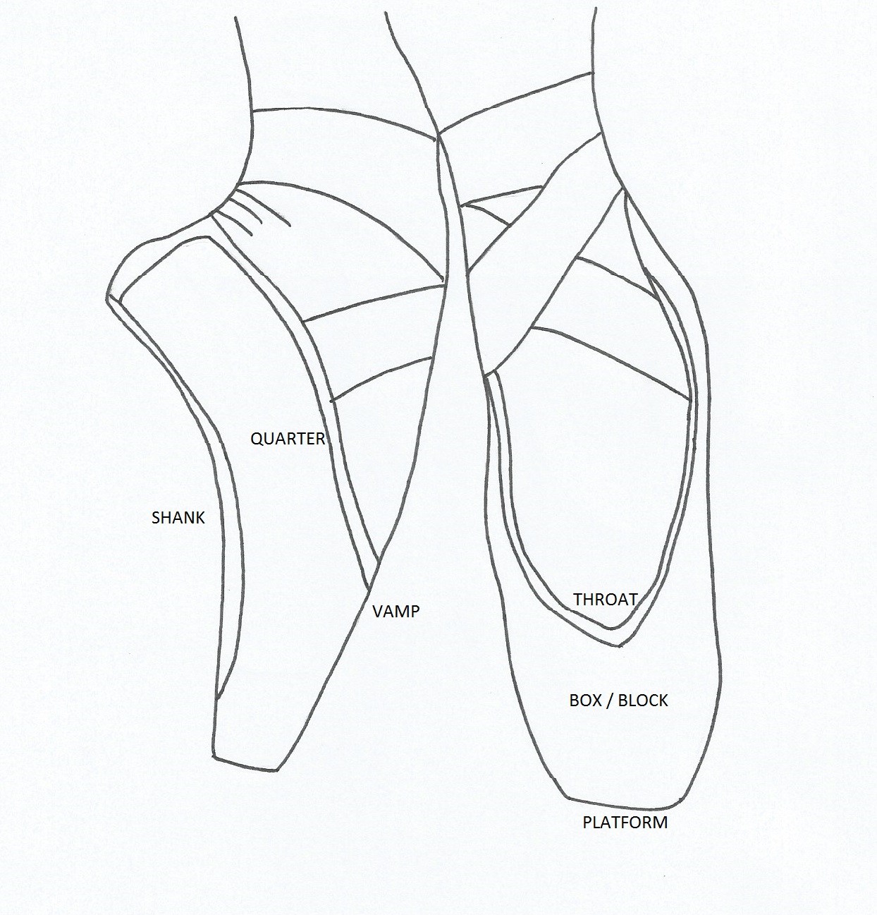
Usually, it’s the shape. People draw a rounded toe because, well, toes are rounded. But a pointe shoe has a "platform." That’s the flat part at the very tip that allows the dancer to stand en pointe. If you don't define that flat edge, your dancer is going to look like they’re balancing on a needle. It’s a common rookie mistake.
Another thing? The arch.
A dead, flat shoe is a sad shoe. When a dancer is on pointe, their arch is pushed forward. This creates a beautiful, sometimes extreme, curve called the "break." If you’re looking at a ballet pointe shoes drawing that feels dynamic, it’s because the artist understood the anatomy of the foot inside the shoe. You aren't just drawing fabric; you're drawing a foot under immense pressure.
The "Box" and the "Shank"
Let’s get technical for a second. You have the "box," which encases the toes. It’s hard. Like, hammer-hard. Then you have the "shank," which is the stiff spine along the bottom of the shoe. When you're shading your drawing, the box should have very crisp, defined highlights to show its solidity.
If you make the whole thing look soft and fuzzy, it loses its identity.
I’ve seen incredible sketches by artists like Edgar Degas—who basically lived at the Paris Opera—and if you look closely at his work, he doesn't draw "pretty" shoes. He draws used ones. He draws the scuffs, the dirty ribbons, and the way the satin stretches tight over the knuckles of the toes. That’s the secret sauce. Realism comes from the imperfections.
The Ribbon Nightmare
Ribbons are the bane of every artist's existence. Seriously. They aren't just tied in a bow like a sneaker. If you draw a bow on a pointe shoe, you’ve basically outed yourself as someone who’s never seen a ballet.
Ribbons are wrapped tight. They cross over the ankle in a very specific pattern and are tucked in so they’re invisible. When you’re working on your ballet pointe shoes drawing, focus on how the ribbon pulls at the satin of the shoe. It creates these tiny, diagonal tension lines. Those lines tell the viewer, "Hey, this shoe is actually tied onto a human being."
- Use long, sweeping strokes for the loose ends if the shoes are being held.
- Use tight, overlapping "X" shapes for shoes being worn.
- Remember the sheen. Satin reflects light differently than cotton. You need high-contrast highlights on the edges of the ribbons to make them pop.
Breaking Down the Perspective
If you’re drawing the shoe from the front, it’s all about the oval of the platform. From the side? It’s about the "pitch."
Think about it this way. A shoe lying on the floor is a different beast than a shoe on a foot. When it's empty, it's slightly curved because of the shank. When it's on a foot, it takes the shape of the dancer's soul. Okay, that's a bit dramatic, but you get what I mean. The shoe becomes an extension of the leg.
You should probably start with a basic geometric block. Don't worry about the pretty details yet. Just get the boxy shape of the toe and the taper of the heel. Most people make the heel too wide. In reality, a pointe shoe heel is quite narrow and hugs the back of the foot tightly.
Shadows are Your Best Friend
Because pointe shoes are usually a pale "ballet pink" (which is actually more of a peachy-tan, let’s be real), the shadows are what define the form. You aren't using color to show shape; you're using values.
The underside of the arch usually falls into deep shadow. The area where the ribbons tuck in creates small, dark pockets. If you're doing a pencil sketch, use a 4B or 6B for those deep crannies. It makes the satin look even shinier by comparison.
Common Misconceptions to Avoid
People think pointe shoes are permanent. They aren't. A professional dancer can go through a pair in a single performance.
This means a "realistic" ballet pointe shoes drawing might show a little bit of the "pancaking" (dancers put foundation on their shoes to matte them out so they don't reflect the stage lights too harshly). It might show the darning at the tip—where dancers sew thick thread around the platform for better grip.
If you include these tiny details, your art goes from "generic hobbyist" to "expert level" instantly.
- The Toe Shape: It’s a blunt, flat surface, not a point.
- The Elastic: Most dancers sew a piece of elastic across the ankle for extra security. Don't forget to draw it!
- The Sole: It’s usually leather and it doesn't go all the way to the edges of the shoe.
Materials Matter
If you’re working digitally, use a soft round brush for the main body of the shoe but switch to a hard-edged brush for the ribbons. The contrast in textures is visually satisfying.
For traditional artists, a kneaded eraser is essential. You can use it to "lift" highlights off the top of the box to simulate that satin glow. If you're using charcoal, be careful not to muddy the pinkish-grey tones. You want it to look clean, even if the shoes are supposed to look "used."
It’s also worth looking at the work of Anna Pavlova’s photographers. The way the light hits her shoes in those old black-and-white photos is a masterclass in value. You can see exactly where the hardness of the shoe ends and the softness of her skin begins.
Getting the "Soul" of the Shoe
There’s an emotional component here, too. A pair of discarded pointe shoes tells a story. They look exhausted. They look like they’ve worked hard.
When you’re composing your ballet pointe shoes drawing, think about the narrative. Are they brand new, stiff and shiny, waiting for their first class? Or are the ribbons frayed and the satin worn through at the toes?
The latter is usually more interesting to draw. The wrinkles in the fabric around the heel, the way the shank is permanently bent—these things give the drawing character.
A Quick Note on Color
"Ballet Pink" isn't one color. It’s a spectrum. Depending on the brand—Grishko, Freed of London, Gaynor Minden—the hue changes. Some are very "peachy," others are almost white, and some have a distinct salmon undertone.
If you’re painting, don't just grab a tube of "flesh tint." Mix a little bit of yellow ochre and a tiny drop of crimson into your white. It’ll look way more natural.
Actionable Next Steps
If you want to master this, stop drawing from your head. Your brain is a liar. It wants to simplify things into symbols.
- Find a reference photo of a shoe that has actually been worn. Look for the scuff marks on the suede or leather sole.
- Sketch the "Box" first. Treat it like a 3D cube in perspective before adding the curves of the fabric.
- Focus on the "V" or "U" shape of the throat (the opening of the shoe). Every brand has a different cut, and this shape defines the look of the dancer’s "line."
- Practice drawing ribbons as long, flat noodles. Don't think of them as lines; think of them as planes of fabric that twist and turn.
- Add "tension lines." These are the small folds that appear where the shoe is stretched over the foot.
Once you get the structural basics down, the rest is just icing. The beauty of a ballet pointe shoes drawing lies in that weird contradiction: it’s a delicate, beautiful object designed to withstand incredible force. Capture that, and you’ve got a winner.
Study the way the light hits the satin. Notice how the highlights aren't just white—they're often a very pale version of the shoe's color. Look at how the shoe sits on the floor; it doesn't just rest there, it has weight. Pay attention to the drawstring—that tiny little knot at the front that helps the shoe stay snug. These are the things that turn a simple sketch into a piece of art that feels authentic.
Grab your sketchbook. Start with the platform. Make it flat. Make it sturdy. Then, let the ribbons flow from there. You’ve got this.
Check the alignment of the heel to the toe. A common mistake is making the shoe look too long or too short. Use the length of the "box" as a measuring tool for the rest of the slipper. Usually, the box takes up about a third of the total length of the shoe when seen from the side. Keeping these proportions in mind will save you a lot of frustration during the layout phase.
Final tip: don't overwork the satin. If you blend too much, it looks like plastic. Keep some of your brushstrokes or pencil marks visible to give the fabric some "tooth" and life.