You’ve been there. You are standing over a bowl of pristine white buttercream, a tiny bottle of "Super Red" in your hand, and a vision of a vibrant crimson cake in your head. Three drops later, you have a bowl of Pepto-Bismol pink. Ten more drops? Now it’s the color of a sunset, maybe, but definitely not red. By the time you’ve emptied half the bottle, the frosting tastes like chemicals and your "red" is a weird, dark magenta that makes everyone's teeth turn blue. It’s frustrating. Honestly, it’s mostly because we treat a food color mixing chart like a rigid set of rules when it’s actually more of a suggestion.
Color is light. It’s also chemistry. When you’re mixing dyes into fats (butter), proteins (egg whites), or sugars (fondant), the rules of the color wheel get a little bit weird. If you want that perfect earthy sage or a deep, moody navy, you can’t just wing it. You need to understand how these pigments actually play together in a bowl.
Why Your Food Color Mixing Chart Usually Fails You
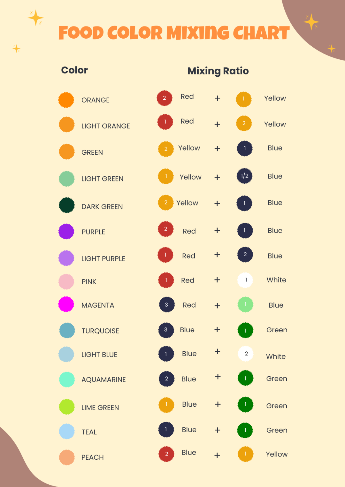
Most charts you find online are way too simple. They tell you "blue plus red equals purple." While that’s technically true in a second-grade classroom with Crayola markers, it’s a lie in the kitchen. If you mix a standard "Sky Blue" gel with a "Rose Pink," you might get a lovely lavender. But try mixing a "Teal" with a "Tulip Red" and you’re going to end up with a muddy, grayish sludge that looks like literal swamp water.
The problem is the base undertone. Professional bakers like Cheenie Abad or the folks over at Wilton know that the starting point matters just as much as the dye. Most food dyes are either water-based or oil-based. If you’re trying to color chocolate with a water-based "Liqua-gel," the whole thing will seize up into a grainy rock.
Then there's the "Developing" factor.
Give it Time to Breathe
Colors darken. This is the golden rule of food coloring that nobody talks about enough. If you mix your frosting to the exact shade you want right now, it’s going to be three shades darker by the time the party starts. This is especially true for reds, blacks, and dark blues. You’ve got to mix it, walk away for two hours, and then see where you’re at. If you keep adding dye to get it dark immediately, you’re going to ruin the texture and the flavor of your bake.
The Essential Color Combinations (That Actually Work)
Let's get into the nitty-gritty of the food color mixing chart in a way that actually makes sense for a real-life kitchen. We aren't just mixing primary colors here. We’re building sophisticated palettes.
The Quest for True Black Don’t start with white. Seriously. If you try to turn white frosting black, you’ll need so much dye the frosting will become runny and bitter. Start by mixing your leftover scraps of frosting together—all the browns, greens, and blues—to get a dark "mud" color. Then, add your black gel. Or, better yet, use black cocoa powder. It gives you a head start and tastes like an Oreo.
Earthy Sage and Moss Greens Everyone wants those "Boho" colors right now. To get a perfect sage, start with a lot of white. Add a tiny drop of Forest Green. Then—and this is the secret—add a tiny dot of Orange or a warm Brown. The orange neutralizes the "neon" brightness of the green and gives it that dusty, organic look.
The "Navy Blue" Dilemma Navy is hard. If you just use blue, it looks like a kid's birthday party. To get it sophisticated, you need a drop of black or a tiny bit of Violet. The purple tones help deepen the blue without making it look "electric."
A Quick Cheat Sheet for Complex Tints
- Terracotta: Mostly Orange, a good squeeze of Brown, and a tiny bit of Pink.
- Champagne: A lot of white, a tiny touch of Ivory, and the smallest speck of Pink.
- Teal: Primarily Blue with a healthy dose of Yellow, then "dirtied" up with a speck of Black.
- Maroon: Red, obviously, but you need a touch of Blue or even Green to kill the brightness and bring in that wine-like depth.
The Science of the "Dirty" Color
In the world of professional color theory, "dirtying" a color is how you make it look expensive. If you look at a high-end food color mixing chart, you’ll notice that none of the colors are "pure." Pure colors look cheap. They look like candy.
To make a color look professional, you usually need its complement. Look at a color wheel. Whatever is directly across from your color is its "mutes" it. Is your purple too bright? Add a tiny bit of yellow. Is your orange too "construction cone" colored? Add a speck of blue. It sounds counterintuitive to add a "clashing" color, but that’s how you achieve those muted, high-end shades seen in professional bridal cakes.
Different Mediums, Different Rules
You can't use the same chart for everything.
Buttercream vs. Fondant Fondant is a sponge. It sucks up color and stays relatively true to what you see. Buttercream is a fat-based emulsion. Because it’s full of air (if you’ve whipped it well), the light hits it differently. You usually need more pigment in buttercream than you do in fondant to get the same level of saturation.
Royal Icing This is the "trickiest" one. Royal icing dries matte. When it dries, the colors tend to intensify and sometimes "bleed" into each other if the humidity is high. If you are doing detailed cookie work, you need to use "no-bleed" formulations or ensure your icing is thick enough that the pigments don't migrate.
Chocolate and Candy Melts Stop. Put down the water-based food coloring. Chocolate is hydrophobic. If you add water-based dye, the fat molecules in the cocoa butter will panic and clump together. You must use "Candy Colors" or oil-based pigments. If you're stuck with regular gel, you can sometimes "save" it by mixing the gel with a little bit of melted cocoa butter or a specialized flo-coat, but it’s a gamble.
Avoiding the "Bitter" Trap
Red and Black are the worst offenders. They require so much pigment that they often leave a chemical aftertaste. To avoid this, look for "No-Taste" Red. Most major brands like Americolor or Chefmaster offer these. They are formulated differently to remove the bitterness associated with the red dye #40.
Another trick? Use natural powders for your base.
- Freeze-dried strawberry powder for pinks.
- Matcha for greens.
- Turmeric for yellows (be careful, it's strong).
- Butterfly Pea Flower for blues.
Using these as a "base" means you only need a tiny drop of synthetic gel to "pop" the color, keeping the flavor delicious and the color vibrant.
Precision Matters: The "Toothpick" Method
Don't squeeze the bottle. Unless you’re making a massive 5-gallon batch of icing, the "squeeze" is your enemy. Use a clean toothpick. Dip it into the gel, then "swipe" it into your frosting. Mix. See what happens. You can always add more. You can almost never go back. If you over-saturate your color, your only option is to add more white frosting, which means you’ll end up with five pounds of frosting you don't need just to fix a color mistake.
Real World Example: The "Dusty Rose" Fail
I remember a project where a baker was trying to match a specific "Dusty Rose" bridesmaid dress. She kept adding pink. Then more pink. The icing was practically neon. She was panicking because the wedding was the next day.
The fix? A tiny, tiny bit of leaf green. It seems insane. Why would you put green in pink? Because green is the complement to red/pink. It neutralized the "vibrancy" and instantly turned that neon pink into a sophisticated, muted mauve that matched the fabric perfectly. That's the power of understanding a food color mixing chart beyond just "yellow plus blue."
Actionable Steps for Your Next Project
Don't just wing it. If you want professional results, follow this workflow:
- Test a Small Batch: Take one tablespoon of your icing and experiment with your colors there first. Keep track of how many "dips" of color you used.
- Mix Early: Mix your colors at least 4-6 hours before you need to decorate. This allows the pigments to fully hydrate and the color to "bloom."
- Check Your Lighting: Never judge a color under yellow kitchen lights. Take your bowl to a window. Natural light is the only way to see if your navy is actually navy or just a dark purple.
- The "Under-Color" Rule: Always aim for one shade lighter than your goal. If it doesn't darken enough after two hours, you can add more.
- Use Quality Gels: Move away from the grocery store liquid drops. They add too much water to your recipes. Invest in a set of high-quality "Liqua-gels." They are more concentrated and won't mess with the chemistry of your bake.
Mixing color is more of an art than a math equation. It requires a bit of patience and a willingness to look at a color wheel. Start small, give it time to develop, and don't be afraid to "dirty" your colors with a bit of brown or a complementary shade to get that high-end, professional look.